Burger Dojo
Burger Dojo is an unforeseen restaurant concept in Finland that combines Asian flavors, hamburgers and an entrepreneur’s love for anime. That’s why the creative concept was also based on a distinctive story, that uses anime inspired style in all the meeting points of the brand. Asian elements are stylishly implemented to the brand, which takes the seeker of new flavors on a journey of discovery.
CHALLENGE
Hamburger chain whose brand is the beef
Burger Dojo was born out of a desire to create something new, as the sensei behind the restaurant had already accumulated years of experience at the Luckiefun’s sushi restaurants. Our task was to build a strong and recognizable brand identity for the new hamburger restaurant serving Asian flavors, which enables the restaurant concept to expand. Burger Dojo’s goal is to grow into a nationwide franchise chain that offers entrepreneurs a stable framework: a distinctive brand, undeniable credibility and a loyal customer base.
The challenge was to find the sweet spot for exoticism: the brand must be clearly recognizable as Asian, but still create an image of quality in order to reach the interest of a wider target group.
CREATIVE SOLUTION
Burger Dojo’s igikai was found in the love of anime and burgers
Igikai is Japanese and means reason to exist. It’s all about passion and finding purpose. Burger Dojo’s brand essence stemmed from the entrepreneurs’ affection for anime and the joyful nostalgia evoked by their childhood’s rare hamburger experiences. That’s why the meaning of Burger Dojo was also found in the combination of anime and exotic hamburgers.
The brand story repeats itself at all the brand’s meeting points, utilizing familiar effects from anime and manga. Burger Dojo takes customers on an adventure that leads the seeker of new flavors on a journey of discovery.
IMPLEMENTATION
The direction of the taste adventure is guided by visual elements
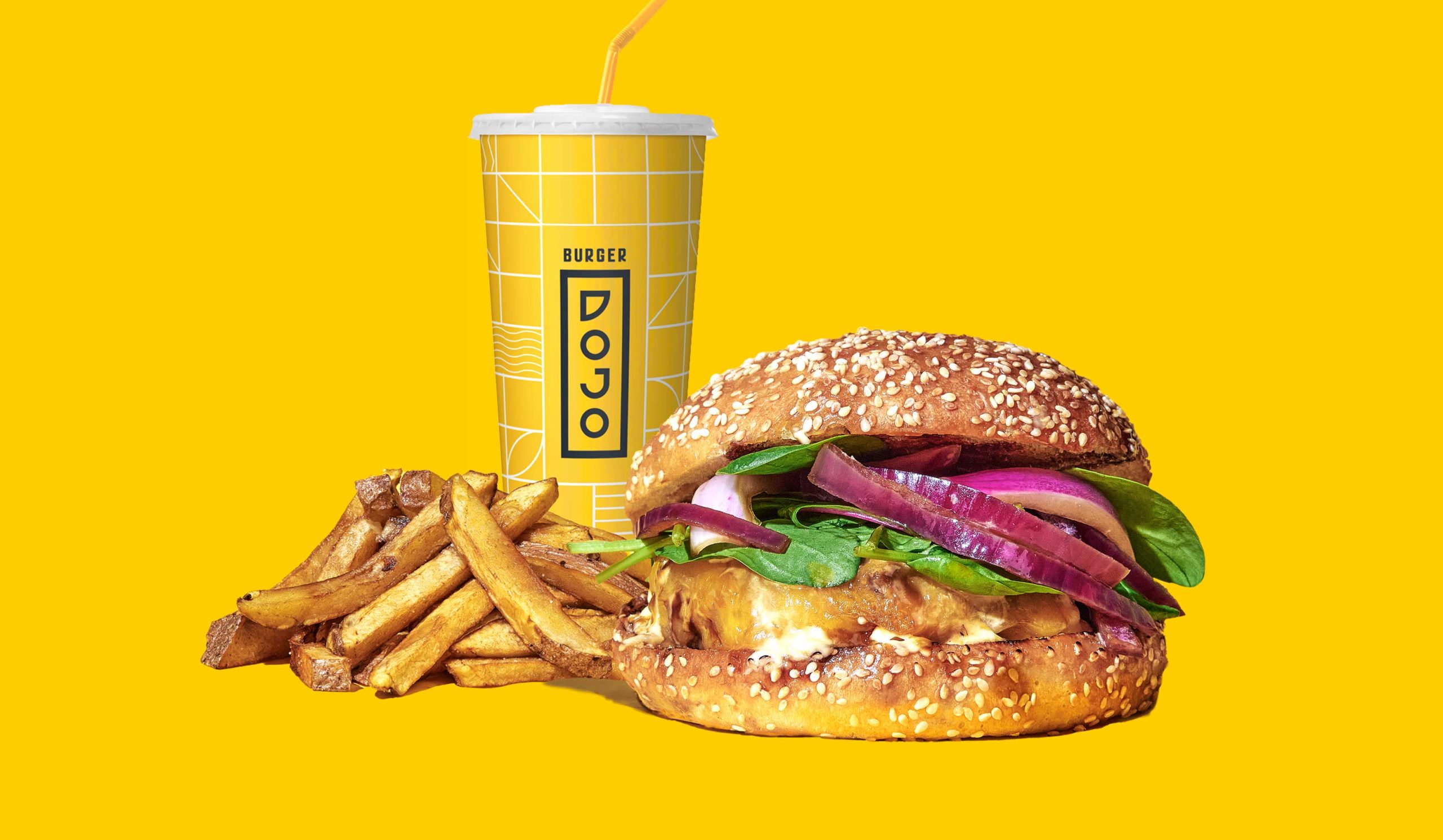
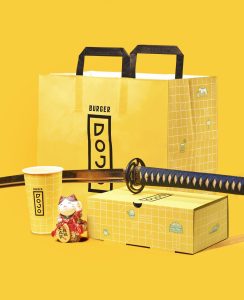
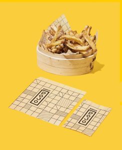
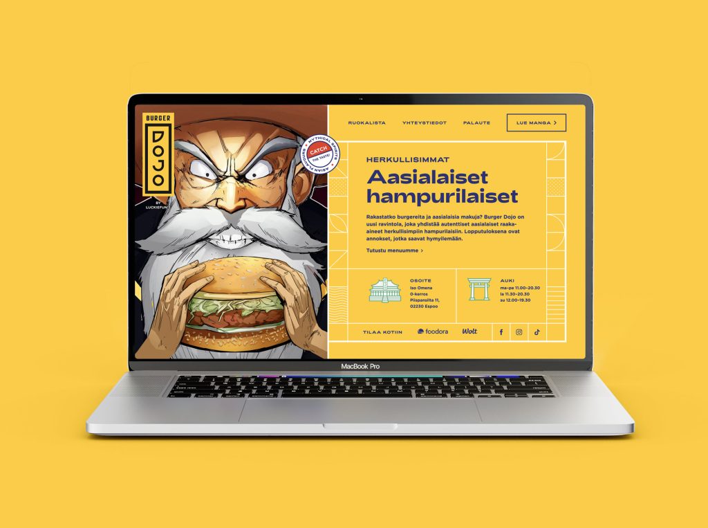
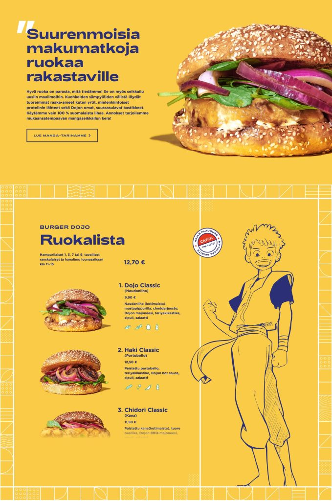
Asian elements are the heart of the brand: the logo is based on vertical typography and the repeated grid comes from the paper walls of Asian buildings, i.e. dojos. The main color chosen was yellow inspired by kung fu movie posters, which stands out from the traditional Asian white-black-red color scheme.
The two types of typography have different styles. The sharpness of the title font creates a contrast to the round shape of the body text, similar to a hamburger bun.
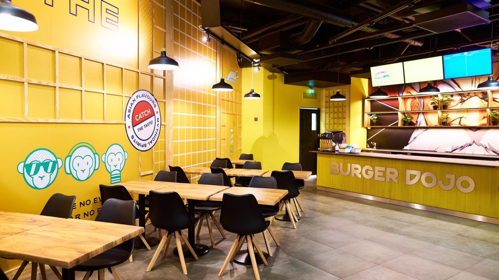
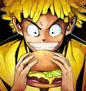
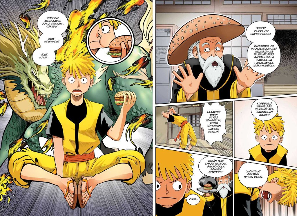
The story of Burger Dojo has been turned into a manga comic, which customers can enjoy while waiting for their food. Ordering takes place with a self-service machine, where the customer meets familiar characters from the manga.
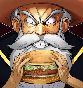
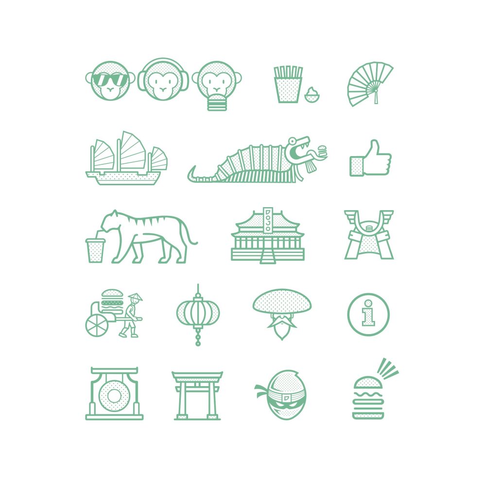
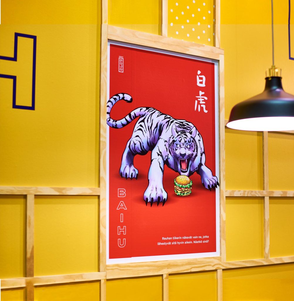
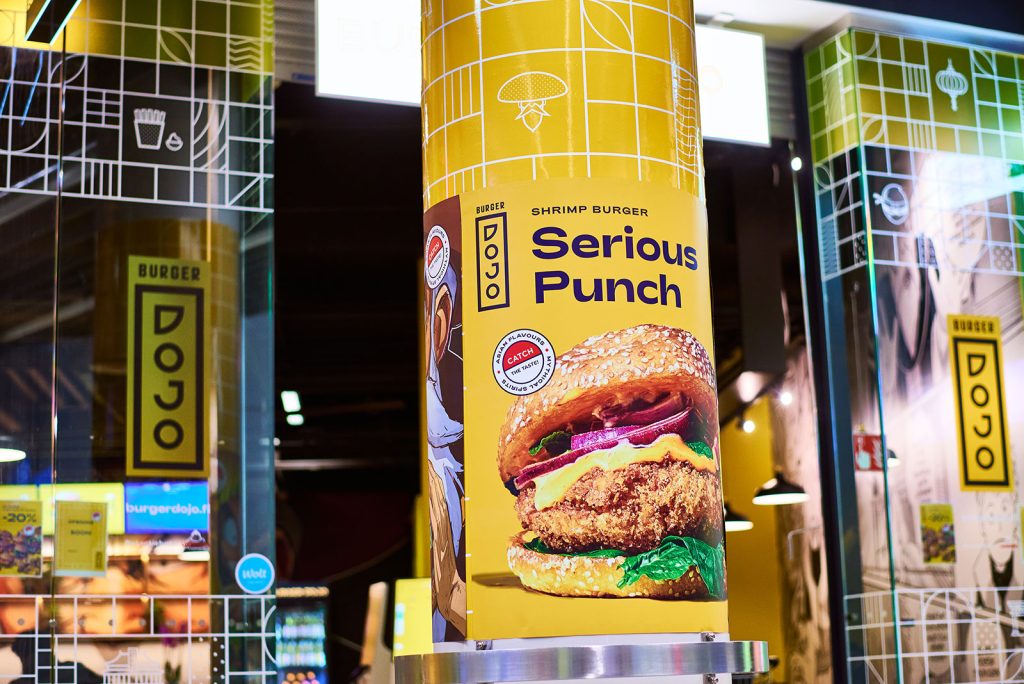
We also designed a series of posters about mythical Asian mythical creatures to support the manga characters. The Pokemon-inspired ball reflects the slogan ”Catch the taste”. The themes of the geometric illustration style refer to Asia, anime and hamburger restaurants.
Get in touch if you wanna know more about the reference:

More references

Rinnekodit
Multi-channel campaign concepts, video and photo shoots, and brand animations for a social enterprise providing social and healthcare services.
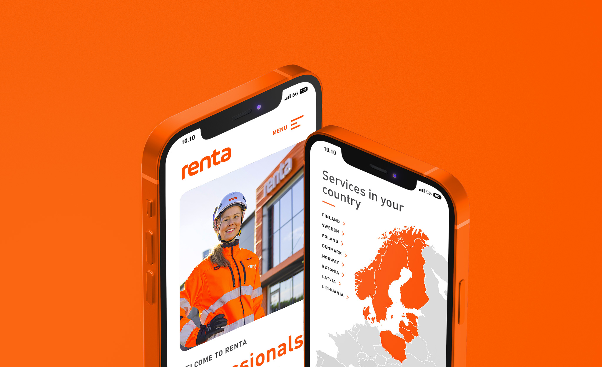
Renta
A multisite solution covering the sub-sites of the Nordic countries for a pioneer in the machine rental industry.
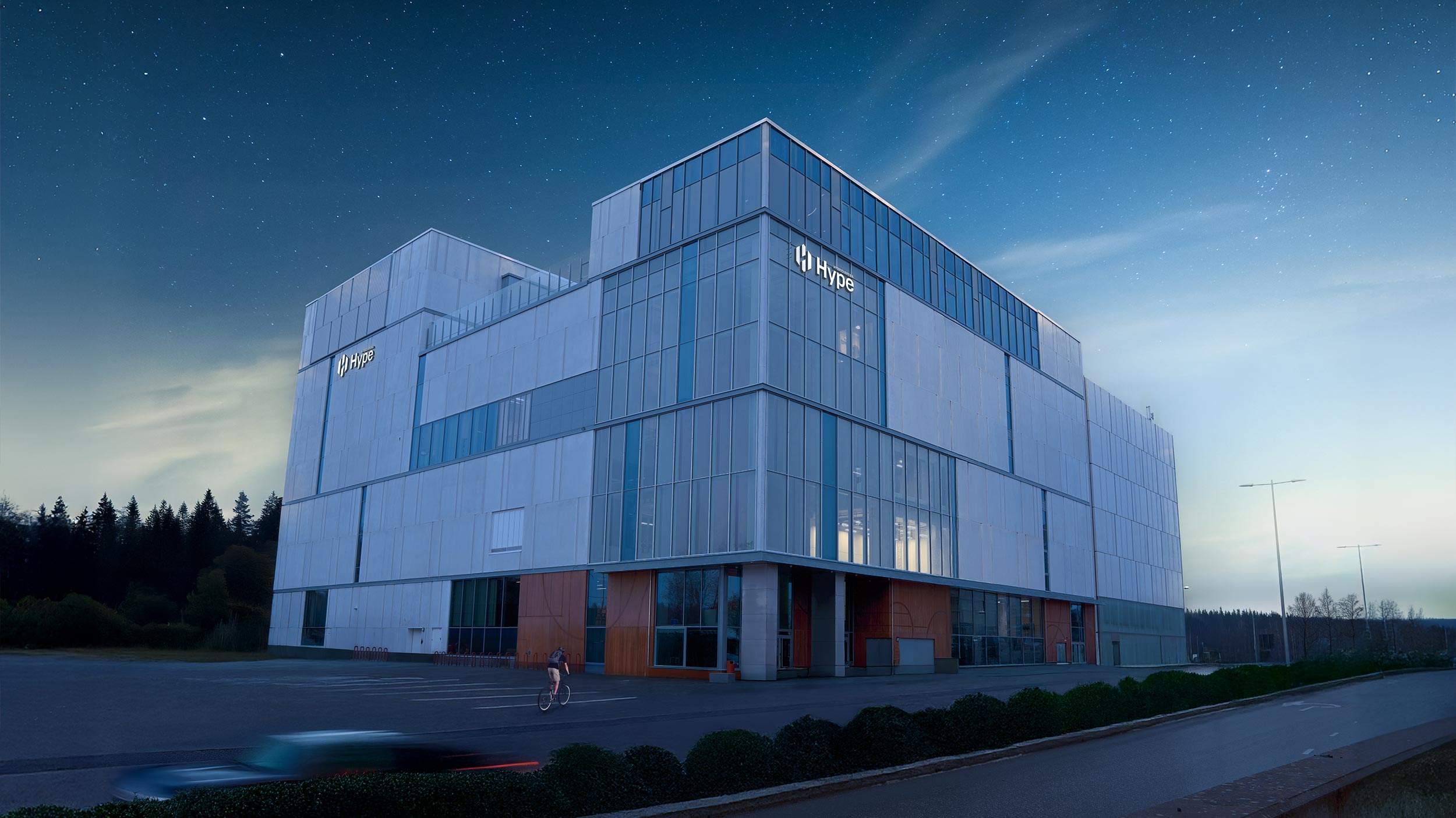
Hybridiarena Hype
Brand identity, marketing, website, booking calendar and online purchase platform for an experience arena in Espoo.
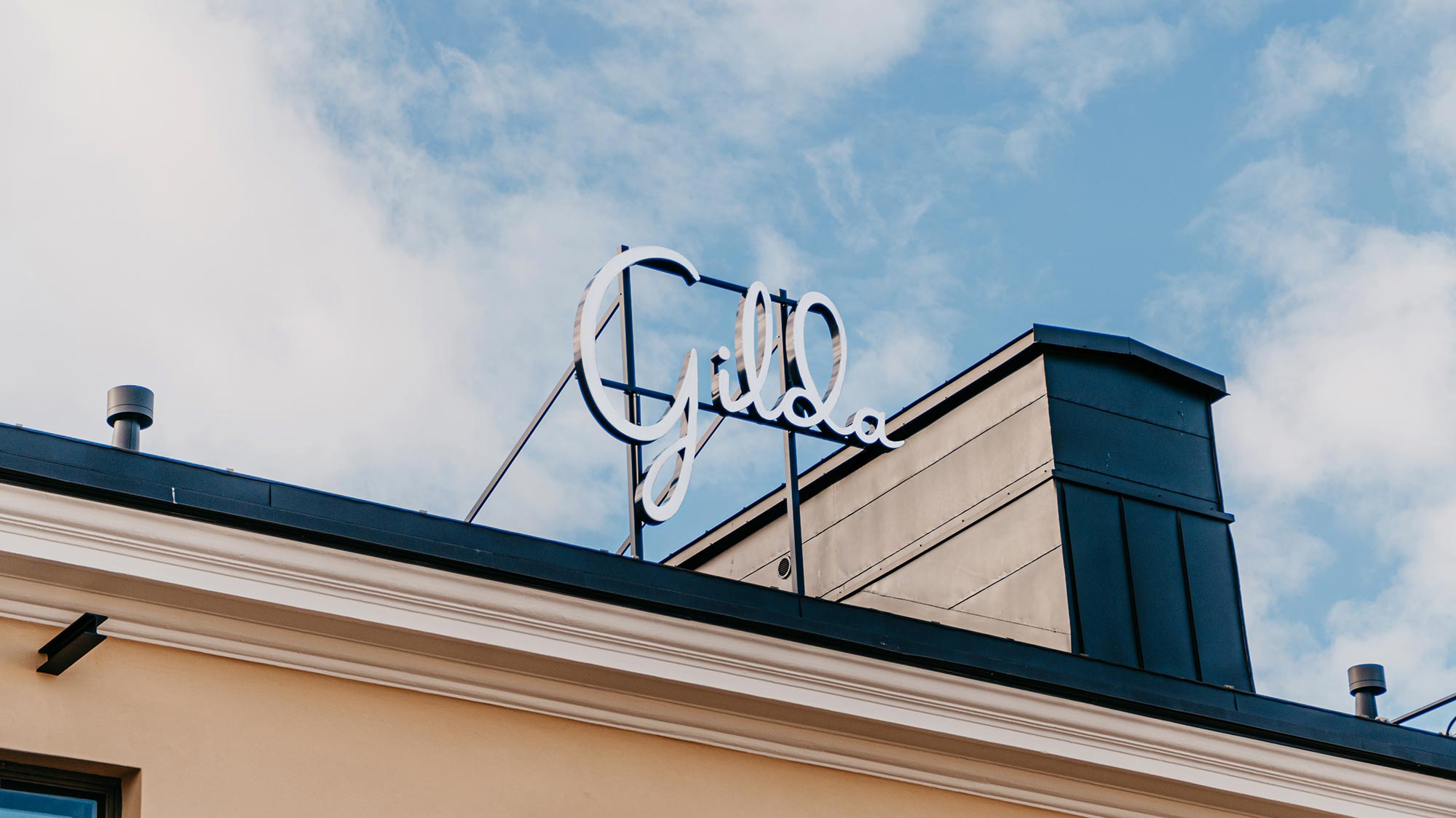
Gilda
Brand identity, website, ticket sales system and marketing for a movie theater.
Mad Hopper
Brand identity, website and product launch for a brewery in Helsinki.
Renta
A multisite solution covering the sub-sites of the Nordic countries for a pioneer in the machine rental industry.